

MONDO Colorset
1 KB, 11 years ago, submitted by
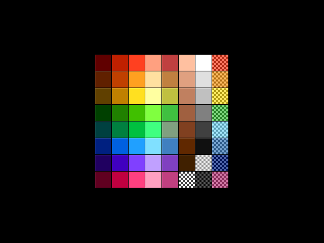
Not satisfied with any existing colorsets, I took it upon myself to create my own. The colors in this set have been carefully picked and crafted for maximum utility and aesthetic appeal. You will see that no space has been wasted on bright, ugly neon colors. It even includes close analogues of the first 9 defaults, as well as several others, so saves created with the default colorset tend to load well. There are exceptions, of course, and as with anything, you may have to tweak things a bit to get it to look just right. Nevertheless, if you're just looking to build something beautiful, be it a city, a landscape, or a piece of pixel art, this colorset is sure to please!
This is technically the third version of this colorset. The first two were posted directly to the forums some time ago, the second of which was uploaded here first. This is an update to that colorset. I think it looks much nicer overall. I hope you agree!
Also, MONDO doesn't mean anything, nor is it an acronym. Don't think about it too hard.
Looks pretty good 4/5
I really like this colorset. Great 5/5
Looks good but sticking with Trueno's.
4/5
Love it, I use it all the time, 5/5
trueno doesn't suck, but doesn't rock... It's overrated for sure, but doesn't suck.