Steam Avatar
You aren't signed in

Azur's ColorSet

1 KB, 13 years ago, submitted by maximel

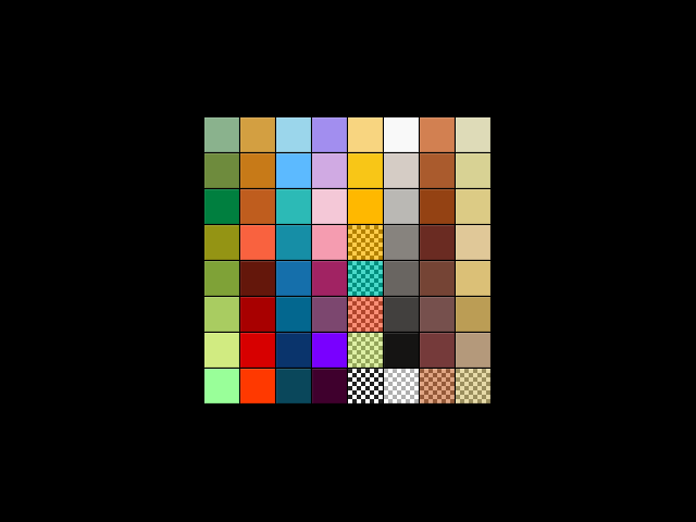
64 colors in 8 categories :

1 - Greens
2 - Orange - Red
3 - Blues
4 - Pink - Purple
5 - Yellow - Transparent
6 - Greyscale
7 - Brownscale
8 - Azur's specials

I really like it but I think it's missing some things. 4/5 no dl, I already found my favorite colorset.
CrazeSpot
my fave colorset is the "Spectrum" colorset, this is good though
Keroro Gunso
Its nice, but it is too brown-ish. You understand what I mean?
How about every one just stop making color sets all together.
littlepile
This would be bad for making water or anything aquatic-y. No blue.
Boomerangdog
Two Words: It sucks
It is completely disorganized and the first look I take of it all I see is brown, grey, red, and like 1 very bright green and 1 dark blue.
1/5
sirrockyqo
I see a crapload of thanksgiving colors
.7\5
Complete crap
Pie Crust
my fav color set is Trueno's color set
Kashik
good job, but you used some of the colors twice
Luke C
@Boomerangdog I agree i was on his server and i had a hard time finding what i wanted. 0/5 :/
bob13
offtopic @Posh,
Witch one? trueno's?


ontopic This is cool, it's lacking some stuff though...
doomdog09
WAY TOO MESSY,should have done a cattigory setup like...

REDZ Blue green etc.
*** *** *** ***
*** *** *** ***
*** *** *** ***
*** *** *** ***
*** *** *** ***
maximel
I make a V3 ....
But I should have let private to hear some rude comments....

And me ,I love my colorset .
doomdog09
what maimel :P?
Nasoa
It may work for some, but I prefer to stick to Truneo's and Yuki-tastic. 2/5
Keroro Gunso
I see you have added more blues, thats better.
ToastHero
I DL'd very nice and original colorset
maximel
Thx
Scooler
Looks very disorginized,
It will be hard for me to navigate threw this.

2/5
FunWaffle
This looks epic! i give it a 1,000,000/10 for this! AND i haven't even USED it!
Sinner
Very nice assortment of colors, but it's all too jumbled to be able to build efficiently with it.
Consider taking the time to sort them out a bit. For example, the blues in line 3 (AKA "cold") should be close together instead of seperated by various others.
Normal
5/5 - 1/5... Trueno's browns on the right take a point away, but 4/5 dude... Nice colors... This IS underrated.